

Having covered the basics of CTAs in Call To Action Marketing Part I, and the importance of good storytelling and the psychology of where to place CTAs in Call To Action Marketing Part II, in part three we’ll explore the design principles that lead to effective call to action marketing.
Design for Tone
One school of thought in CTA marketing is to use vibrant power colors such as red or orange to grab attention, but red would be the last color a dentist would want to use given the stress that most people have about visiting the dentist. So too with an accounting firm given the association of the color red with negative cash flow.
Banks use a lot of blue, as blue conveys intelligence and trustworthiness. A motivational speaker may want to convey inspiration and empowerment, and would want to choose colors that convey that, such as orange or light blue. An environmental firm might want to use green to convey an earth connection, but dark green is seen as a money color, which they may want to avoid. Conversely a financial services firm may like the use of dark green.
CTAs do need to capture attention, but not at the expense of conveying a tone that is inconsistent with the brand. Taking the time to choose colors, fonts and web design styles that conveys the tone of your brand will not just help your website look better, but your CTAs will be more effective as well.
Below are a couple of examples of CTAs we’ve design for our clients that accurately conveys the tone of the brands.
In this example the color is subtle and grounding, and yet the design of the CTA is elegant, and therefore inviting in the context of the type of service provided.

In this example we’ve conveyed sophistication and intelligence, together with the energy of red to motivate action.


This simple “Contact Us” box in orange is effective, because it’s designed to pop, and fits with the urgency of “Appointments made within the hour!”
Use of Photography
One of the most effective ways to draw attention to a CTA is to use photography in the background. We can place copy directly on the image or lay a semi-opaque screen over the photo to give contrast to the copy, as in our first two examples above. In either case, this is a powerful way to convey the tone of brand while motivating action.
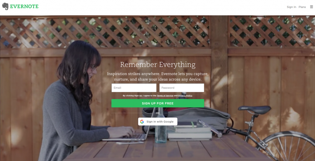
Evernote actually uses video in their above-the-fold home page call to action to give even more energy and sense of brand tone. They also use inspirational language to give even more dimension to the CTA.
Here’s another one of our designs in which we utilized a striking photograph conveying the warm and inviting tone of the product, together with the lush greenery of the outdoors coming through the windows. The “Take The Tour” button is subtle, as in this case the photo draws the attention well enough so that visitors will easily find the button.

In this example we’ve conveyed the kind of clarity that this brand wishes to convey—that through their product we will have crystal clear vision. So the icons are simple and transparent, allowing the image to come through.

Calls To Action Add Depth
When we have good website design, with great storytelling, where we’ve identified logical breaks and transitions in our content to include CTAs, and the CTAs are visually stimulating and continue to convey the tone of the brand, then we are giving our users the impression that to click on a CTA—to contact, subscribe, or learn more—that their experience of connecting with us and doing business with us will be consistent with all they’ve seen on our website.
This consistency and layering of tone and brand story adds depth to a website, and it’s this depth that gives viewers an impression of a brand as being credible, substantial and real.
Summary
CTAs need to capture attention, but not at the expense of brand tone. The use of color, font style and design need to convey the tone of the brand, while also capturing attention. The use of photography in CTAs is a powerful way of conveying tone while also drawing attention to the action you’re asking users to take. Well designed CTAs that accurately convey the tone of the brand, while drawing attention, give depth and dimension to a website, which makes your company seem substantial in the eyes of your users.
Also see,
Call To Action Marketing Part I
Call To Action Marketing Part II


